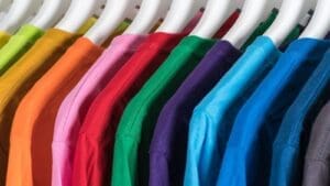
Choosing a T-shirt color might seem simple at first. Once you start comparing shades and contrast, it becomes clear that not every combination works the same. The right summer T-shirt color combinations can completely change how a design comes together.
Color plays a big role in how your design is received. A strong pairing based on basic color theory makes the shirt feel clean and wearable, while a poor color scheme can make even good artwork look flat or harder to read.
Why Color Pairing Matters More Than You Think
In custom apparel, the shirt color does more than sit in the background. It actively shapes how your design is perceived. Good summer T-shirt color combinations rely on principles from the color wheel, especially when using complementary colors to create contrast that guides the eye and improves clarity.
When the pairing works, it can:
- Improve the readability of your design or logo
- Make your brand colors look more polished and consistent
- Increase the chances that people wear the shirt beyond the event
- Help custom apparel feel more modern and professional
When it doesn’t, even a strong design can feel visually noisy or unbalanced.
The shirt color becomes part of the overall color harmony, setting the tone before anyone reads the artwork.
Start With the Mood You Want To Create
Before choosing colors, think about the feeling you want the shirt to give off. Summer designs often use lighter palettes, but your color scheme still depends on the purpose and audience.
Ask yourself:
- Should it feel energetic or relaxed?
- Is it meant for an event, a team, or everyday wear?
- Do you want it to stand out or blend in more naturally?
Summer T-shirt color pairings work best when they follow simple color harmony rules, whether soft or bold.
- Beach events often use lighter colors for a relaxed, airy feel
- Promotional shirts rely on stronger contrast for better visibility
- Casual wear usually works best with soft, balanced color schemes
- Branded apparel benefits from consistent brand colors for recognition
Classic Pairings That Always Work
Some color combinations work because they follow basic color theory and maintain a good balance between contrast and simplicity. These summer T-shirt color combinations often mirror familiar color wheel relationships.
White Shirt + Bold Print Colors
Clean and highly versatile. Works especially well for logos and detailed graphics, particularly when paired with strong ink contrast.
Navy Shirt + White or Light Designs
A classic color scheme that feels professional, clean, and easy to read.
Black Shirt + Bright Accents
High-impact contrast often used in bold brand colors or promotional designs.
Light Gray Shirt + Soft Tones
A balanced neutral base that supports subtle color harmony without overwhelming the design.
These options work because they support the design instead of competing with it.
More Modern Summer Color Directions
For a more current or style-driven look, newer summer T-shirt color combinations are becoming more popular. These ideas often draw from natural palettes and modern color trends.
Sand or Beige + Deep Green or Navy Accents
A grounded palette often paired with forest green tones for a natural and balanced appearance.
Pastel Blue + Coral or White Details
A softer color scheme that feels seasonal, relaxed, and easy on the eyes.
Olive Green + Cream or Tan Prints
Earth-inspired combinations that rely on muted tones and subtle contrast.
Soft Yellow + Charcoal or Dark Brown Accents
A warm palette that blends lighter colors with deeper tones for readability and balance.
These combinations tend to feel modern without becoming overly trendy.
Choosing Colors Based on Who Will Wear the Shirt
Color choices should always reflect the audience and the purpose behind the shirt. Even strong summer T-shirt color combinations can fail if they don’t fit the people wearing them.
For example:
- Corporate teams usually perform best with black, white, navy, or gray-based color schemes
- Event giveaways benefit from brighter, high-contrast combinations
- Youth groups tend to respond well to bold complementary colors
- Lifestyle or merch brands often lean toward muted tones and earthy palettes
The goal is to create shirts people actually want to wear instead of something that only works for the event itself.
Make Sure the Design Stays Visible
Even the best pairing fails if the design doesn’t stand out clearly. Visibility is one of the most important parts of choosing effective summer T-shirt color combinations.
Before finalizing a design, check:
- Does the print contrast clearly with the background color?
- Can the design be read quickly at a glance?
- Does it still look good outdoors in natural lighting?
- Are smaller details still visible from a distance?
Strong color harmony helps the design communicate clearly, which is especially important for events, uniforms, and promotional apparel.
Keep the Color Scheme Simple and Wearable
One common mistake in custom apparel is using too many competing colors within the same design. Simpler color combinations usually perform better because they feel cleaner, more modern, and easier to wear.
Well-balanced designs often:
- Look more professional
- Improve readability
- Feel less overwhelming visually
- Stay wearable long after the event ends
The best custom shirts usually combine strong contrast with practical everyday style.
Frequently Asked Questions
What are the best summer t-shirt color combinations?
The best combinations balance contrast and readability. Navy and white, black with bright accents, and soft neutrals with bold prints are popular choices because they stay visually clear and easy to wear.
How does color theory affect t-shirt design?
Color theory explains how colors work together and how they affect visual perception. It helps you choose combinations that feel balanced, whether through contrast or softer blends.
What is a complementary color in shirt design?
Complementary colors sit opposite each other on the color wheel, such as blue and orange or red and green. They create a strong contrast that helps designs stand out clearly on shirts.
How do I choose a color scheme for custom shirts?
Start by considering your audience, purpose, and brand colors. Then choose a color scheme that keeps the shirt, ink colors, and design style consistent.
What shirt colors work best for readability?
High-contrast colors work best for readability, such as black and white or dark navy with light ink. These combinations ensure text and graphics remain clear in different lighting conditions.
Ready to Bring Your Custom Apparel Idea to Life?
Whether you’re designing shirts for a school event, business promotion, sports team, fundraiser, or group trip, Anytime Tees makes the process simple from start to finish.
We offer high-quality custom t-shirt printing, bulk order discounts, fast turnaround times, and professional design support to ensure your apparel looks exactly how you imagined it.
From bold graphics to clean, minimalist logos, our team helps you choose the right shirts, printing method, and sizing options for your project.
Start your custom apparel order today and see why so many customers trust Anytime Tees for dependable quality and service.
Contact Anytime Tees now to get your custom quote and begin your design.